Bebesh Cuba


Bebesh Cuba
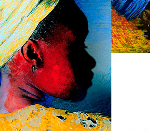
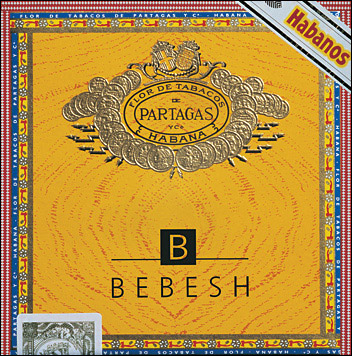
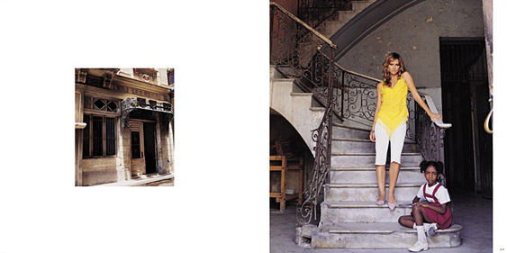
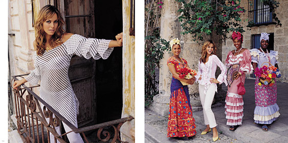
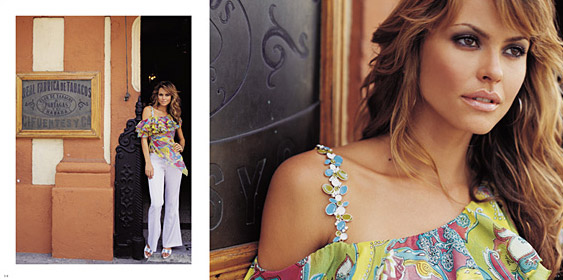
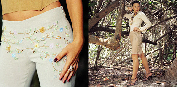
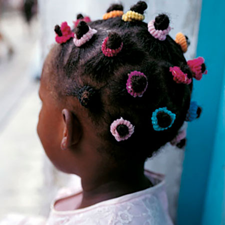
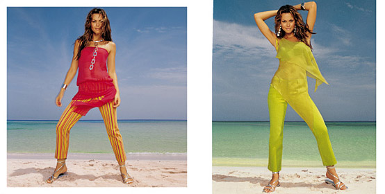
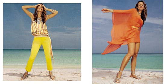
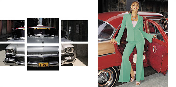
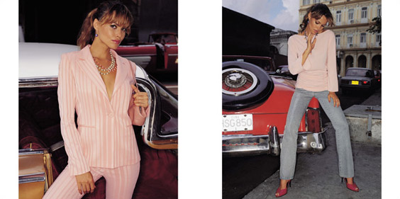
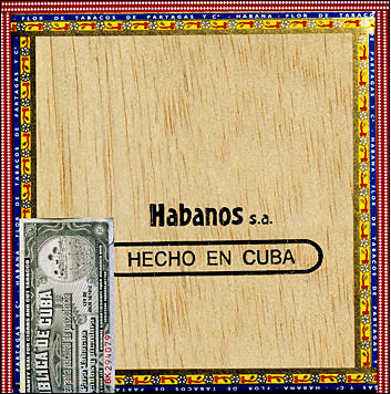
Primeiro projeto desenvolvido para fortalecimento e reposicionamento da marca nos mercados de varejo e atacado, com absoluta fidelidade de cores e nova proposta de edição visual, característica adotada pela empresa até hoje, pela comprovada eficiência. A identidade – nome e logotipo – necessitavam de nova direção para aparecer e ser reconhecida nacionalmente. Defini que a coleção seria apresentada organizadamente no formato quadrado como a logomarca, em editoriais de moda com estilos agrupados, para simplificar a compreensão do comprador. O catálogo Cuba projetou o cliente no mercado com significativo aumento de vendas no setor e reposicionamento desejado no segmento. A coleção foi apresentada e presenteada como uma caixa de charutos cubanos com logotipo em ouro.
Fotos: Valério Trabanco. Tratamento de imagem: André Costa. Produção: Paula Lang. Make up & hair: Wilson Eliodorio.
This was the first project developed to strengthen and reposition the brand in both retail and wholesale markets, with absolute color fidelity and a new visual editing approach—an aesthetic the company has maintained to this day due to its proven effectiveness. The brand identity—name and logo—needed a new direction in order to stand out and gain national recognition. I decided that the collection would be presented in an organized way, in a square format reflecting the logo, with fashion editorials grouped by style to simplify the buyer’s understanding. The Cuba catalog elevated the client’s presence in the market, resulting in a significant increase in sales and the desired repositioning within the segment. The collection was presented and gifted in a box designed to resemble Cuban cigars, featuring a gold-embossed logo.
Categoria:
editorial
Projetos relacionados